Python Histogram
Histogram shows distributions of values. Histogram is similar to bar graph but it is useful to show values grouped in bins or intervals. For example, we can collect the age of each employee in a company and show it in the form of a histogram to know how many employees are there in the range of 0-10 years, 10-20 years, etc. For this purpose, we should take the employee ages and bins (or intervals) as:
emp_ages = [22,45,30,59,58,56,57,45,43,43,50,40,34,33,25,19]
bins = [0,10,20,30,40,50,60] #of 10 years' range
Histogram
The bins list contains 0,10,20... This indicates the ranges from 0 to 9, 10 to 19, etc., excluding the outer limit. To draw the histogram, we should use hist() function as:
plt.hist(emp_ages, bins, histtype='bar', rwidth=0.8, color='cyan')
Here, histtype is 'bar' to show the histogram in the form of bars. The other types can be 'barstacked', 'step', 'stepfilled'. The option rwidth = 0.8 indicates that the bar's width is 80--. There will be a gap of 10-- space before and after the bar. If this is decreased, then the bar's width will be narrowed.
A program to display a histogram showing the number of employees in specific age groups.
Histogram Example

#histogram of employee ages
import matplotlib.pyplot as plt
#take individual employee ages and range of ages
emp_ages = [22,45,30,59,58,56,57,45,43,43,50,40,34,33,25,19]
bins = [0,10,20,30,40,50,60]
#create histogram of bar type
plt.hist(emp_ages, bins, histtype='bar', rwidth=0.8, color='cyan')
#set labels
plt.xlabel('employee ages')
plt.ylabel('no. of employees')
plt.title('ORACLE CORP')
plt.legend()
#draw the histogram
plt.show()
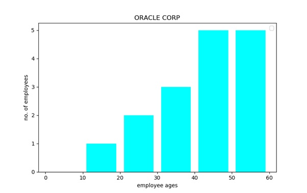
From the output, we can understand that this company has more employees in the age group of 40 to 59 years. It infers that most employees in the company are above the age of 40.