Python Pandas - Dataframe Bargraph
A bargraph represents data in the form of vertical or horizontal bars. It is useful to compare the quantities. Now, let us see how to create a bar graph with employee id numbers on X-axis and their salaries on Y-axis. We will take this data from the data frame. First of all, we should import the packages as:

import matplotlib.pyplot as plt #for drawing the graph
						import pandas as pd #for creating the data frame
Suppose the data frame is created from 'empdata' as:
df = pd.DataFrame(empdata)
This data frame 'df' contains various pieces of data like empid, ename, sal and doj. We want to take only the 'empid' and 'sal' for the purpose of drawing the graph. This is done as:
x = df['empid']
y = df['sal']
We can draw the bar graph by calling bar() function of pyplot module as:
plt.bar(x, y, label='Employee data', color='red')
We can display a label (or title) on X-axis and Y-axis using xlabel() and ylabel) functions as:
plt.xlabel('Employee ids')
plt.ylabel('Employee salaries')
We can provide company's title using title() function as:
plt.title('Digi Brains Academy')
We can also display legend that refers to colors and labels of data especially when different sets of data are plotted as:
plt.legend()
Finally, the graph can be displayed by calling the show() function as:
plt.show()
A Python program to display employee id numbers on X-axis and their salaries on Y-axis in the form a bar graph.
Bar.py
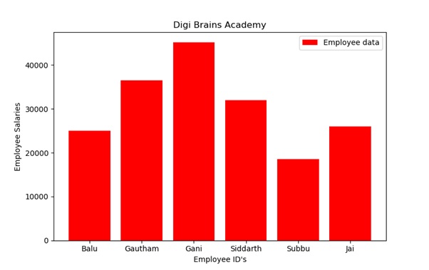
From the above output, we can infer that the employee with id number 1002 is drawing the highest salary and next to him the employee with id number 1003. We can create bar graphs from more than one data set that are coming from multiple data frames. For example, we can plot the empid and salaries for 2 departments: Sales team and Production team. For this purpose, we can call the bar() function two times as:
plt.bar(x,y, label='Sales dept', color='red')
plt.bar(x1, y1, label='Production dept', color='green')
A program to display employee id numbers on X-axis and their salaries on Yaxis in the form of a bar graph for two departments of a company.
Bar1.py
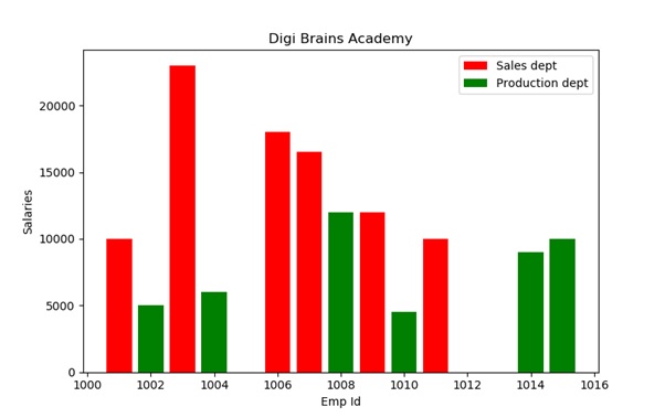
From the above output, we can understand that the Sales department people are drawing more salaries when compared to those of the Production department.